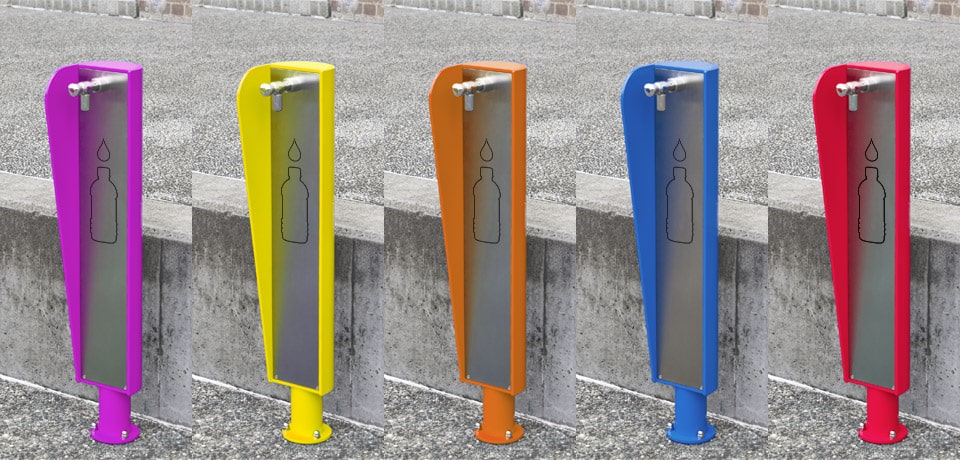
The use of colours not only brightens up an area by making it stand out and giving it character, but it is also symbolic of a whole range of feelings and emotions. Colours are used to depict a number of moods, making it the ideal tool for using on street scapes. The choice of certain colours effectively works to create a feeling and set the mood of a location.
Colour symbolism is a powerful tool and should be considered as just another component of the architecture and design involved in a project. People may not even be aware of colour symbolisms, and more importantly won’t even realise the effect it’s having on them, e.g. the use of orange in a restaurant to increase their appetite!
 Power and aggression are the most obvious emotions evoked from red. It is an intensive colour used to boost a person’s energy and desire, often encouraging a person to make a quick decision.
 Producing a warming emotion, orange produces the feelings of enthusiasm, energy and happiness. It is often used to persuade people to partake in an activity, particularly socialisation as well as being an appetite stimulant.
 Another colour that evokes a warming emotion, the colour of sunshine, produces pleasant feelings of joy and enlightenment. Yellow is an energising colour used to relieve depression and encourage people to communicate.
 The relaxing emotion of green, conjures up refreshing and tranquil feelings. Green is used to relax and sooth people, mentally and physically. More obviously is its association with nature, symbolising growth, freshness and food.
 Representing cool and calmness of the mind and body, blue is also associated with peace, tranquil and harmony. It is an appetite suppressant, lowering a person’s respiration and blood pressure, to create the calming emotive.
 Invoking a playful emotion, it makes a person feel young and alive. Pink is used as combination of representing love and caring, as well as also symbolising innocence and youth.
 The ambitious and uplifting emotions of purple, make it a popular choice for eccentric people. A symbol of power, luxury and extravagance, it is also used to calm nerves and encourage creativity.
 The purest colour in the spectrum, white is the symbol of cleanliness and everything its associated with. The pure, sterile feeling of white can be used to encourage a person to relax their bodies and offload their troubles.
 With similar characteristics as purple, black is representative of power and elegance. It is used to promote a sense of style, prestige and sophistication.
So next time you are designing a project, why not take advantage of the power of colours and use them as a tool for achieving the desired feeling and mood of a location.
** The BF200 Drinking Fountain is the feature image for this article.
